
Have ever been losing hours on small details when making your business PowerPoint presentation?
Or perhaps you have been frustrated to spend hours editing its content and not focusing on creating your message?
Or even struggled to make a presentation that looks professional, ending up looking like a cheap stack of poor slides? Been there done that. Many colleagues around you are probably in the same situation.
People take approximately 50 milliseconds to decide whether your company is trustworthy and professional.
The seriousness of the presentation is therefore related to its design rather than its content. Making a good impression is absolutely worth spending a few minutes on the look and feel.
PowerPoint is inherently designed to help you lose focus and time.
With little effort and a small tool set, you can significantly reduce the time of making your presentation.
And make your slideshow look more professional. Let’s have a look.
Why you spent hours making that simple presentation
In PowerPoint, you can edit every little detail about every single element in every slide: positions, colors, sizes.
While making a presentation, your mind will, therefore, be quickly switching from “What am I telling my audience? to “Should I use a #FFFFFFF or #FFFFF00 for the color of my text?” or “Should I put my points in bullets or in boxes?”.
After editing every slide individually, it will take you much time the to do a single change on your whole presentation. For instance the color of your title on every slide.
The key to making the presentation efficiently is to focus either on design (how does it look) or content (what is my message): never do both at the same time.
Ideally, you will start preparing your layout and never come back to it once you start creating the content.
As a consequence, if you edit every little detail in every slide, your presentation will likely look inconsistent. The title was red on one slide and is now yellow.
Imagine if this happens with every element on the slideshow.
The result is cluttered, and your audience tries to keep up with the flow from one slide to the other.
This focus is not put on listening to you speaking, or even less on your content.
10 quick steps away from a quality PowerPoint presentation
In this article, we focus on designing a beautiful and robust presentation that drastically improves your workflow.
We are not covering the making of the message, storytelling or goal of your presentation.
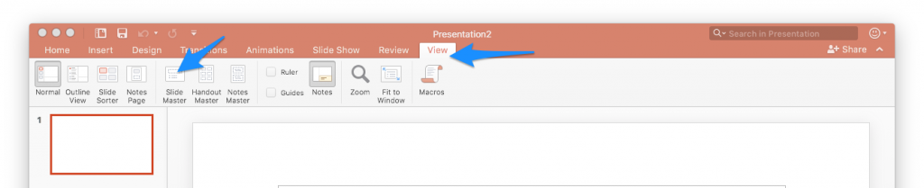
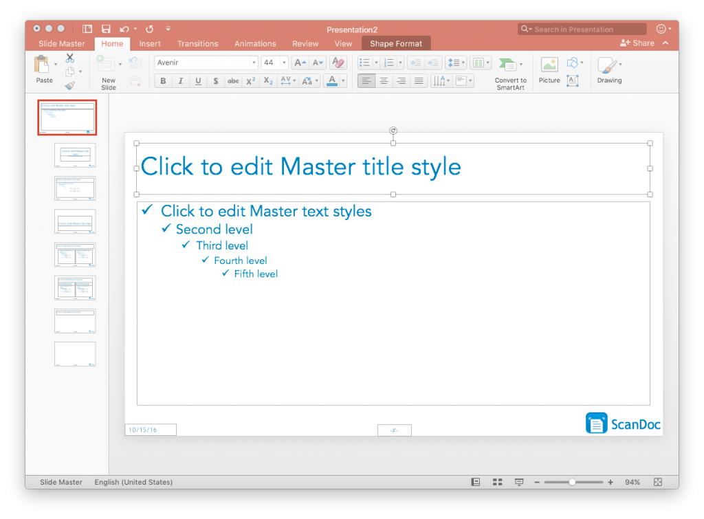
To achieve our goal, we leverage PowerPoint Slide Master. It allows you to edit the standard type of slides layouts. You can personalize how they look when starting the presentation.
Once created, you make the content slides and select the correct standard layout (called Master Slide). It will automatically format the slide to the rules of this standard.
Less is More
In order to make the presentation stand out, we use the principle that “less is more”.
By making the Slide Master light and uncluttered, we get a clear, and professional presentation (think about Apple’s Keynotes):
- Fewer colors (2 main colors and maximum 5)
- One font
- One title
- One content columns (or max 2)
- One standard layout for chart
- One standard layout for image
Example of poor PowerPoint presentations
It is sometimes difficult to know how to make the PowerPoint presentation look good, but it is very easy to spot a terrible one!
Avoid the following if you don’t want to reach the above result:
- Standard PowerPoint Template background
- Background with various shapes and colors
- Slides cluttered with lots of text and charts
- Small text
- Images with corners that do not blend with the background color
- As many colors as a rainbow
Making a robust design
Making a good design is not only about making a beautiful presentation. It also helps you produce the presentation efficiently:
- All aesthetics elements are defined first and are never altered later in the process,
- Never worry about aesthetics when creating the content,
- There are enough Master Slides to be flexible,
- You have the minimum number of Master Slides to reduce the maintenance and creation process,
- Any change that you will make to the Master Slides later in the process will be applied to every slide without exception
Implement the workflow
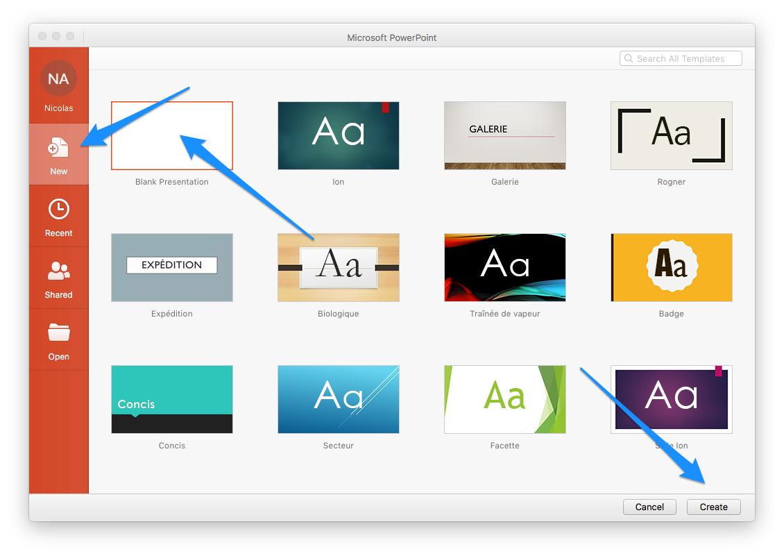
Step 1: Create a blank PowerPoint Presentation
Step 2: Edit the Slide Master
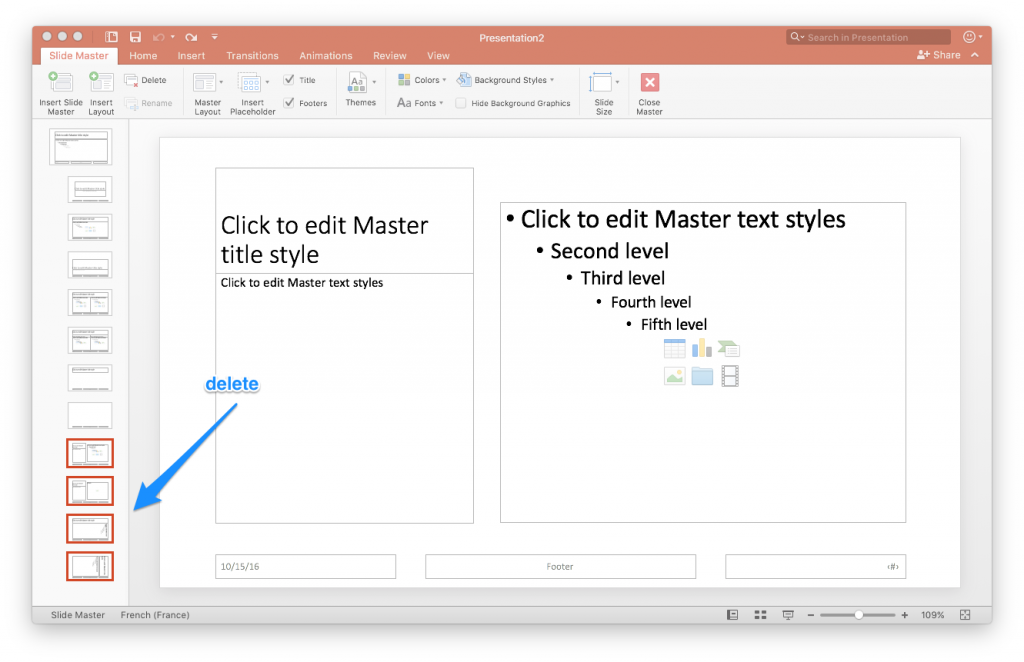
Step 3: Use only the needed slides, delete the rest
The key is simplicity. You do not want to edit slides you will never use.
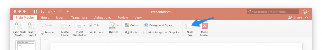
Step 4: Switch to Widescreen 16:9
Unless rare cases, you will present on modern wide screens. It will look awesome at once!
Step 5: Delete useless elements (e.g. number of pages, date, footer, unless you need it)
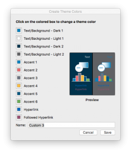
Step 6: Define a color palette
To choose the colors of your palette:
- Consider using the color of your logo or another visual reference that you have. In my case, the main color is a light blue taken from the logo.
- Keep white for the background, or to make sure that it contrasts well with all your other colors. White gives light and clarity. It will work with all the other colors as long as you ensure a good contrast. Furthermore, white will look white on all projectors, good or bad. And opening your slideshow during a business meeting, you may want to avoid any surprise.
- The other 3-4 colors are here to accentuate and will be used in charts.

Step 7: Choose a font, apply it to all visible boxes
Same as above, use the same as your business references (logo, the usual color used).
Font (as colors) is critical to maintaining a brand consistency across all your branding material (proposal template, website, brochures, business cards etc.)
Another important point: avoid using an original or rare font. You must check its compatibility on other devices. A font may work on Mac and not on Windows, and vice-versa. The system reading the presentation will swap with a standard font if not supported. It can look totally different, you want to avoid that.

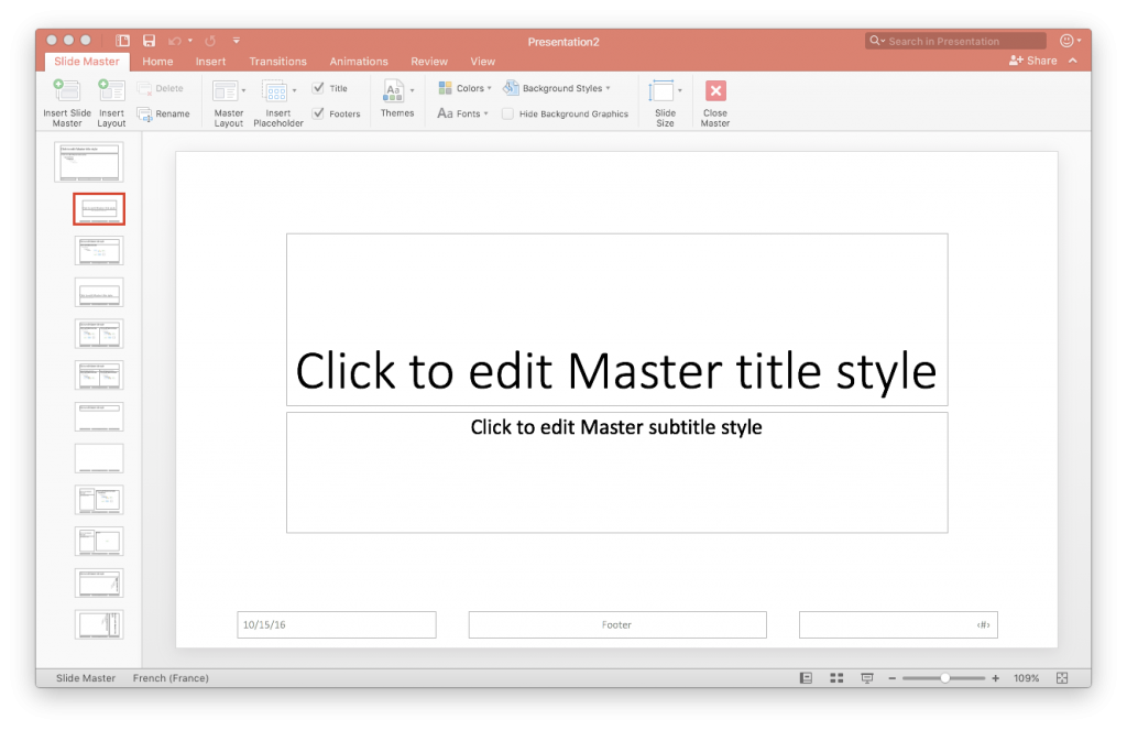
Step 8: Define the position of the key elements (title and content)
Keep in mind the readability of the content on a screen, and that you have enough air between every box of content.
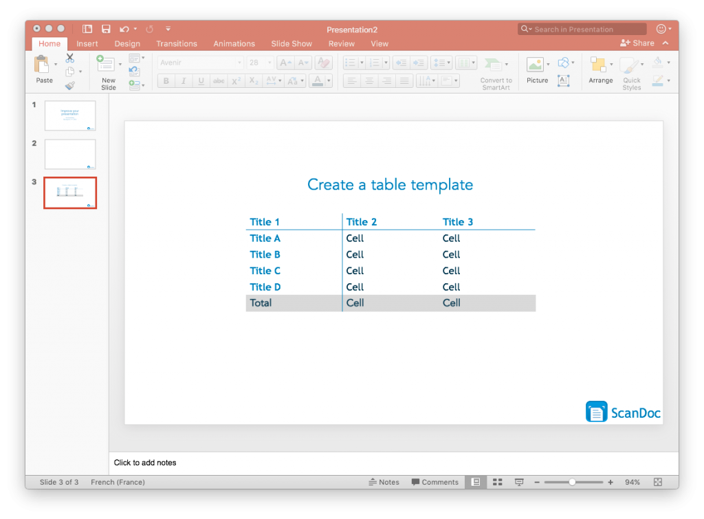
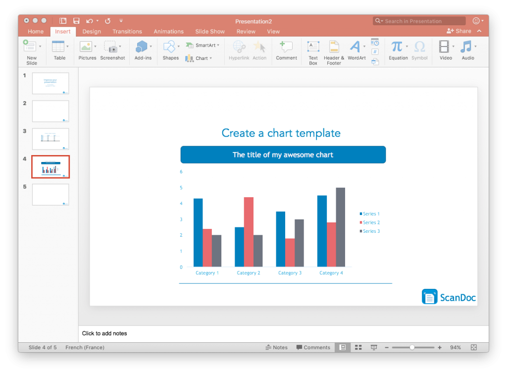
Step 9: Create template slides that can be used by copy-pasting
- Create a table template: use your creativity but stick to simple. Remember that you will need to edit it with the right number of cells and columns.
- Create a graph template
- Create any other needed object, e.g. standard box for your organizational charts
Note: There are different ways to reach the same result. For instance, you can create a master slide including the template for the chart.
I personally find it more flexible to have a few backup slides in the template presentation with your template chart and table. You can just copy paste them.
One could argue that if I change the style of table or chart I have to modify every slide and lose the robustness. If you have a better solution which is flexible and robust, please explain it in the comment section.
Step 10: Make the presentation content
In this step, you create all the slides you need, every time applying the desired Master Slide. Only change the content of the boxes.
Finally, review and enjoy the result.
A few rules to improve the quality
In order to make it look good, you may want to consider the following suggestions:
- Define simple shapes to format your presentation, and stick to it
- Do not modify the text under any circumstance, PowerPoint does it for you if required. If it does not, use “shrink to fit” function in the parameter of your box. If it still does not adapt, you have done something wrong when drafting your template: modify your template.
- Do not overload the slide with information: not more than 5-6 bullets
- Repeat yourself many times, in words, in a text, or images. It enhances the memorization process.
- Heavy slides with lots of text will bore your audience to death. The slides are not your speech, they are here to help you make the point when speaking. Not the opposite.
- Lay out a clear structure for your slideshow and remind it throughout the slides when changing section
To take it further
The point of this article is to improve the workflow to reach the 80/20 quality, i.e. make a great presentation yet super fast. You will find online some very good article or books that cover the design part of the presentation.
To take it to the next level, you can check out the following books:
- PowerPoint 2016 For Dummies, by Doug Lowe
- PowerPoint Surgery: How to create presentation slides that make your message stick by Lee Jackson
Disclosure: This post may contain affiliate links. That means I may make a small commission (at no cost to you) if you make a purchase. This will help to support theleanfox.com!